INTRO
London Singapore
Stockholm
LATEST
Hello, my name is Bryan. I live in Sweden and I design visual identities and marketing campaigns – in digital and in print – for brands, individuals, and organisations – so we can be better seen, understood and remembered.
With a strong foundation in the traditions of typography and design, I love weaving images together with ideas to create stories that are emotional, cultural, and strategic.
Here's my latest work as Senior Art Director at Bolon where I work with campaigns and product launch
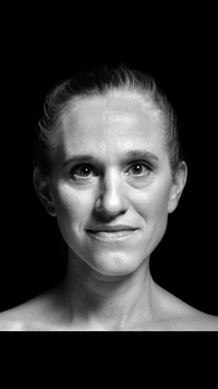
— TRULY COLLECTION CAMPAIGN
— Bolon R, Svenska Designpriset nominated, Best Film in Graphic Identity
In addition to working with clients directly from my own practice, I have also worked in some of the most exciting studios, agencies, and companies in London, Singapore, and Stockholm – ie. Nick Bell Design, Landor, Interbrand, Bolon and Spotify.
My work and opinions have been published and exhibited in London, Birmingham and Singapore.
Central Saint Martins and London College of Communication –
BA (Hons) Graphic and Media Design, 2005
SAY HI
Feel free to get in touch —
b@bryanloke.com
+46 72 150 8680
Here are some of the projects which I've designed and led from start to finish.
CONCEPT +
ART DIRECTION
360° Campaign for Bolon's Truly Collection.

When the face is the canvas and also the message.

— Campaign Teaser —

— Website —

— Collection Film —


— Social Media —


RECOGNITION
Svenska Designpriset – Best Flim in Graphic Identity!
— The campaign film I directed for Bolon was nominated for The Swedish Design Prize 2011.

CAMPAIGN
+ BRANDING
New Product Launch Campaign, Bolon Made-to-Measure Rugs.

Your floor's favourite new best friend.
DESIGN +
ART DIRECTION
Employer Branding Design at Spotify


Global visual communication on steriods.
TESTIMONIAL

Endless amounts of creativity...
– Kay Vasey, Director of Arts, British Council
BRANDING + CURATORIAL
Architecture Exhibition
for British Council & Royal Academy of Arts, London


A complex concept made captivating.
CONCEPT + BRANDING
A Public Art Festival
coinciding with Singapore's F1 Race.


First of its kind.
BRANDING
+ SPATIAL DESIGN
A Thai Photography Exhibition for the Royal Thai Embassy

Thai-Embassy-Bryan-Loke-Event-Design

Thai-Embassy-Bryan-Loke-Event-Design

Thai-Embassy-Bryan-Loke-Event-Design
A delicate balance of the traditional and the modern.
TESTIMONIAL
His fresh ideas responded perfectly to our brief...
– Rod Leaver, CEO
EDITORIAL + PHOTOGRAPHY
40th Anniversary Book
for a Real Estate Firm

BryanLoke-Coffee-Table-Book-Editoral-Design

BryanLoke-Coffee-Table-Book-Editoral-Design

BryanLoke-Coffee-Table-Book-Editoral-Design
BryanLoke-Coffee-Table-Book-Editoral-Design
A tactile celebration
of the past, present, and future.
TESTIMONIAL IN FULL
As Senior Art Director, Bryan has been an important resource to our marketing activities with his cutting-edge expertise in creating unique, engaging, and creative concepts. He has worked closely with our Chief Creative Officer and owner, as well as with people from the marketing department. As a person, Bryan is creative, positive, possesses great knowledge, has high energy, and is committed. He has done his job and services to great satisfaction and with excellent results, we can therefore give our very best recommendations.
– Marie Eklund, CEO, Bolon
Bryan Loke has a great attitude towards his work. With endless amounts of creativity, he is always keen to share his ideas for each project. He is able to take on a wide variety of work and assisted with both the corporate website and all of the different printed and digital work required for our Arts projects. It is always a pleasure to work with Bryan and I would be happy to recommend him to anyone seeking high-quality design work.
– Kay Vasey, Director, Arts, British Council Singapore
Our company reached an extremely important milestone in 2013 having operated in Singapore for forty years. We wished to record the history of the business in a coffee table book that conveyed the contribution of our people and the innovation that allowed us to contribute positively to Singapore’s development.
Bryan was chosen over a talented competitive field to partner with us in designing the book. We all greatly enjoyed working with Bryan due to his fresh ideas that responded perfectly to our brief and also his collaborative approach to ensure that we achieved our aims. The book is a great testament to our heritage and I am very happy to endorse and recommend Bryan to you.
– Rod Leaver, CEO, International Real Estate Firm